

Determinant is a menswear brand built around the philosophy of purposeful living. The brand focuses on functional, well-engineered garments designed for individuals who value clarity, simplicity, and intention in their daily lives.
Its visual communication reflects these principles through structured layouts, restrained aesthetics, and a disciplined approach to design.
Working within the Tessellation Group brand team, I contributed to translating these values into consistent visual systems across retail, packaging, digital platforms, and marketing materials.
Business Goal
The key communication objective was to present Determinant as a modern functional menswear brand that balances practicality, accessibility, and thoughtful design.
Design needed to:
-
communicate clarity and structure
-
simplify complex product information (such as sizing systems)
-
maintain a disciplined visual tone
-
ensure brand consistency across both physical retail and digital environments.

Brand Overview & Visual Identity System
The visual system for Determinant draws inspiration from fashion pattern paper, reflecting the brand’s emphasis on precision and engineered design. A subtle “+” cross motif was developed as a graphic structure, referencing garment construction while symbolising clarity, balance, and disciplined thinking.
The motif functions as an underlying layout principle applied across retail environments, packaging, and communication materials, creating a consistent visual language that supports Determinant’s philosophy of structured, purposeful living.
Visual Guidelines Development
I led the development of a structured set of visual guidelines to ensure consistency across Determinant’s digital and physical brand touchpoints.

Brand Playbook

Visual Guidelines

Print Guidelines

Digital Guidelines
These documents defined key principles such as typographic hierarchy, grid structure, image treatment, and spatial rhythm. By establishing a clear visual framework, the guidelines enabled marketing, retail, and external production teams to maintain a consistent and disciplined brand presentation.
Selected pages from these guideline documents are shown below.
Brand Playbook


Visual Guidelines


Print Guidelines
Visual Guidlines


Digital Guidelines


Retail & Spatial Graphic Applications
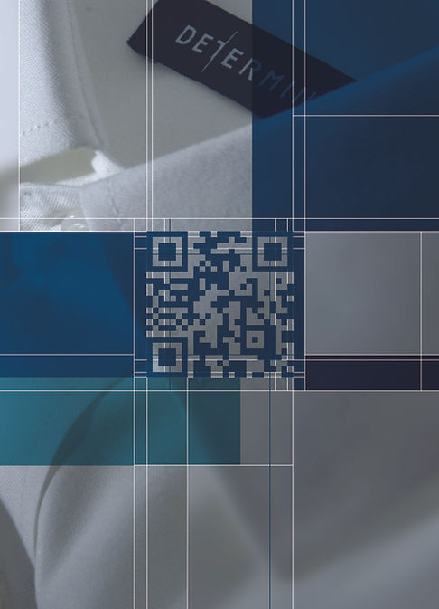
A range of in-store communication materials was developed to articulate Determinant’s key product proposition of 61 shirt sizes. Through infographics, display systems, and interactive elements, complex product information was translated into clear and engaging retail experiences.
In-Store Communication System


Interactive QR & AR Integration
op.jpg)

Spatial Installation & Material Display
Conceptualised and designed an acrylic installation illustrating shirt construction. Layered panels displayed garment components — cuffs, buttons and plackets — aligning to form a complete shirt when viewed frontally. The installation translated garment drafting precision into a three-dimensional in-store brand expression.


Retail Infographic System – Long Rider Development
Developed an infographic long rider to communicate the brand’s “61 sizes” proposition clearly at the point of decision. Complex sizing information was simplified into structured visual modules for quick readability while browsing. A macro fabric image highlights the brand’s material focus, transforming the functional hanger into an extension of the visual identity.
Packaging Development
Led the end-to-end design and production of the paper bag, applying the “+” grid structure to reinforce visual discipline. Matte lamination enhances the refined aesthetic, with careful control over material quality, print accuracy and structural durability to align with the retail identity.

Integrated Campaign Rollout
The campaign was executed across print and digital platforms, maintaining consistent hierarchy, typography and visual rhythm.Print materials included key visuals, promotional posters and retail graphics, while digital adaptations ensured clarity and pacing for screen-based formats.


Digital Campaign & EDM Execution
The campaign extended into email marketing communications, with layouts designed for clear typographic hierarchy and structured information flow. Attention was given to CTA placement, image-to-copy balance and mobile readability, ensuring consistency with the campaign's visual language across digital touchpoints.
Print Advertising – Fashion Show & Outdoor
The campaign extended into large-format print, including PolyU Fashion Show materials and taxi advertisements. Grid structure and golden ratio principles ensured visual balance and legibility at scale, translating the brand’s structured identity into high-visibility public communications.


Website Planning & Digital Direction
Contributed to website planning and collaborated with external agencies to align layout structure, visual hierarchy and brand assets. Responsibilities included page structure planning, visual consistency review and asset coordination between internal marketing and development teams.
Social Media Strategy & Grid System
The Instagram feed was structured in modular sequences, with every three posts forming a micro-series to maintain visual rhythm. Lifestyle imagery frames the left and right panels, while the center post focuses on close-up product details to anchor the narrative. Golden ratio segmentation and cross-structure alignment maintain visual balance, allowing the feed to function as a cohesive branded canvas rather than isolated posts.
